During the era of the late 1990’s to early 2000’s, graphic design began its transition to web. This is when graphic artists became more experimental, especially with the release of software and new technologies such as Quark Xpress and Adobe Illustrator. Artists became more engaged to adopt new and elaborative typography.
OpenType fonts appeared in the market in the year 2000. Prior to that, in 1996, new format technologies: PostScript and TrueType were invented by a collaboration between Adobe and Microsoft.
Choosing the right typefaces is essential to design. “The typeface matters because of its power to create a sense of recognition and trust.” For example, the movie Avatar faced a huge amount of backlash for choosing Papyrus for the subtitles.
| A screenshot from the 2009 Avatar movie using the typeface Papyrus. This movie is argued as one of the best films made, however the typeface choice says otherwise. Image: (https://baneofsimplethinkers.files.wordpress.com/2011/01/avatar.jpg)
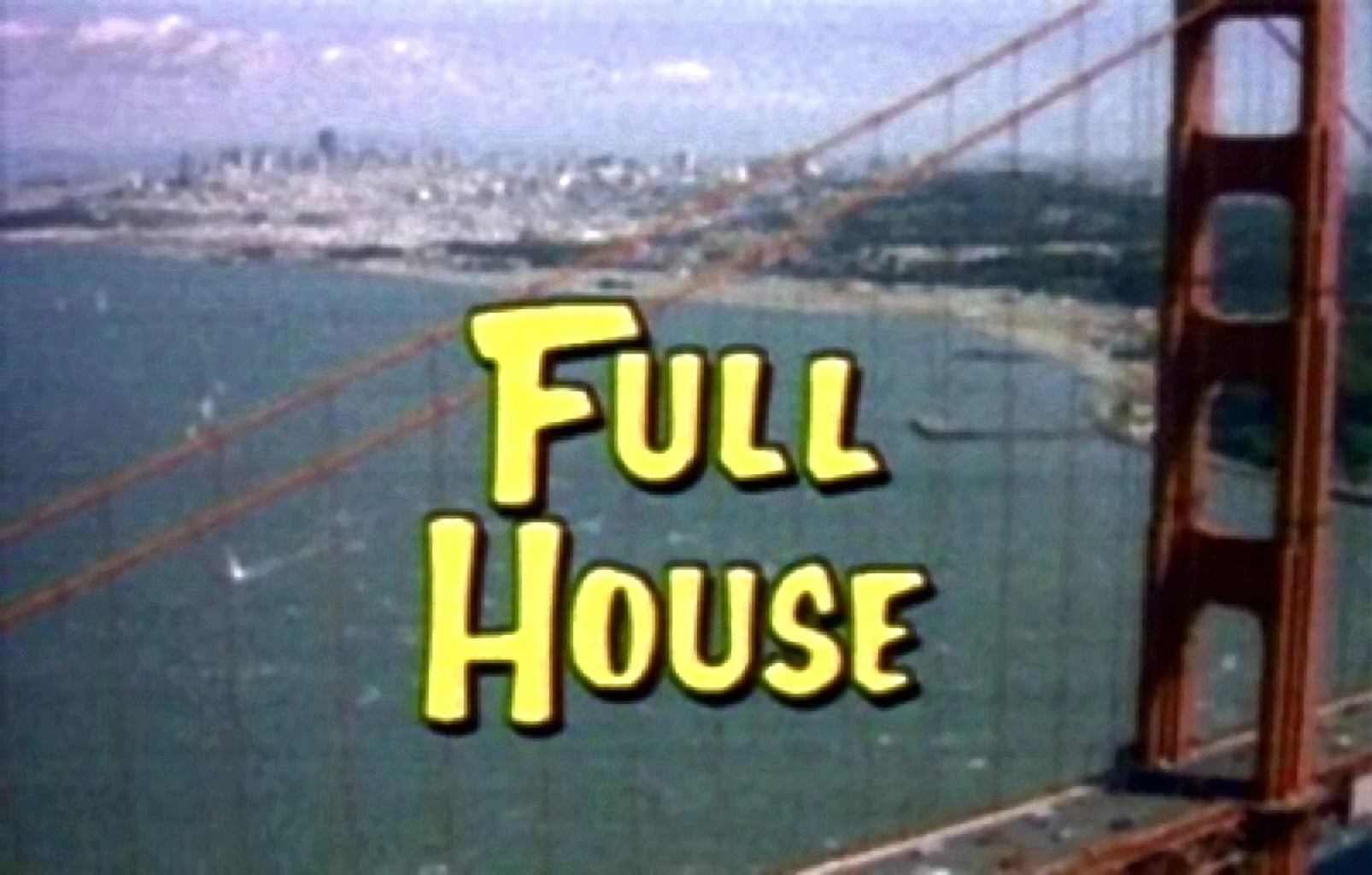
Certain typefaces bring back memories and nostalgia of sitcoms, movies, and advertisements of the 90s and 00s. In many of the examples below, common similarities include the use of sans serif fonts, vibrant colours, and clean designs all to make the text the dominant feature.
Notable Person: Kevin Cooper is an American designer known for title sequences. In the example below of the title sequence for cult classic, “Se7en”, where Cooper introduces post-modern typography to the design of film titles.
“The typography itself — which would likely break several guild legibility rules in modern times — was hand-etched into black-surface scratchboard and manipulated during the film transfer process to further smear and jitter it,” (Radatz, 2012).
Due to his contribution to title sequences in cinematography, he is known for restoring title sequences as an art form. In the title sequence below, hand-drawn type is incorporated with Helvetica.
Therefore, choosing the right typeface is like choosing something to wear. Designers create for the purpose of impacting viewers to remember, not forget. The next blog post will discuss famous typefaces which were frequently used in the late 1990′s and early 2000′s.
|
)
)
)
No comments:
Post a Comment