Monday, November 21, 2016

Welcome to my blog!

GCM 110 Assignment 2
Hi my name is Rachel and welcome to my blog!  On this blog, you will discover the typography trends of the late 1990s to late 2000s.

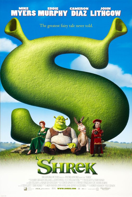
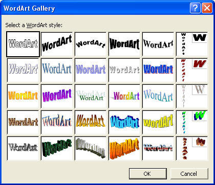
Typography is a way of communicating ideas.  It is often overlooked, however the use of typography is essential to our daily lives, it is the art of arranging text where it is legible and appealing. That being said, the use of typefaces is essential in the design process.  “The entire appearance of a printed piece can be affected by the choice of typographic style,” (Pocket Pal, 2007).  Back then, typefaces were accepted, rather than chosen.  With the evolution of technology, certain design trends and styles are bound to change as the years go on.  Typography is not the same as it used to be back then.  Typography is always changing, it is ambitious.
The following blog posts will discuss the typography era in the late 1990’s to early 2000’s, regarding the various typefaces, typography style trends that were popular back then.

The research done for this assignment will identify the trends of typography and famous typefaces used back in the late 1990’s to early 2000’s.  Click below on the following links to read the blog posts. 

Typography Trends

Trends and fads come and go.  Same can be said about typography.  One trend that was popular in the late 1990's was none other than the grunge era.  So what did this have to do with typography?  Typography worked around trends.  Type design became messy and lawless. In this generation, type was essential to the design of zines, concert posters, and commercial advertising, for example the infamous Fight Club poster and Playstation print ads. Designs in this era was new, it was fresh, it was expressive, it had not been seen before and thats what makes it special.  "Expression at the time was a backlash, a revolt against the consuming hyper-cleanliness of current design," (Palladino, 2013).  However due to the excessive use of grunge typography, it started to become less appealing, thus concluding that once again, trends come and go.  Once grunge typography was no longer popular, this sparked the interest in clean, simple, and classic designs in the early 2000's.  

NOTABLE PERSON: David Carson who is known as the "godfather of grunge".  This American designer is known for his use of experimental typography in the rock and roll magazine, Ray Gun.  His work has led to the widespread art movement of the grunge typography era.  
Image: http://www.davidcarsondesign.com/img/mini/nationaltheatre.jpg
http://dcd.rawquality.com/img/mini/ra4.jpg

New programs and technology were introduced in the midst of the 1990s, therefore enforcing new ideas.  The ability to design and alter typefaces was completely changed. Fonts were either being completely created from scratch or based off a preexisting font. Designing by hand was no longer the only option for creating. 


In many of the advertisements in the 90’s either a lot of white space was used or solid vibrant colours were placed as backgrounds.  Print advertisements in particular, I found in my research, were very text heavy, as seen in the images below. The advertisements in this era challenged visual norms, contrasting to what we see today.  These advertisements were fairly simple and image driven - using bright photographs or images along with a large headline to capture viewers’ attention.  Only until the 2000s, advertisements started to experiment with digital manipulation. 


Image: https://assets.blog.hemmings.com/wp-content/uploads//2011/02/Volvoracingad_700.jpg
http://designcrowd.s3.amazonaws.com/common/blogs/100YearsOfPrintAds/100YearsPrintAds_41.jpg

http://file.vintageadbrowser.com/pkkwgf8jf9zmau.jpg


Looking at the typefaces used in these movie posters include the use of custom font faces created strictly for the promotion of the film.  Thus, began the use of custom font faces. With Disney’s blockbuster animations, their movies are marketed with the intention of using a custom font.  “Disney movies have customized fonts for their blockbuster features,” (Ali, 2014).  The Disney logo itself is even made up of its own font, which is a casual script, which is similar to handwriting type. Thus contributing to the wave of using custom font faces, drifting away from traditional type design to more experimental and creative designs and layouts.  


Image: http://img.cinemablend.com/cb/d/1/1/c/d/f/d11cdfb3ce481917
c0d0d4a8e257226638b52f9768ab0115a42e1e8145baf527.jpg

 http://www.impawards.com/2001/posters/shrek_ver2.jpg
 http://vignette2.wikia.nocookie.net/pixar/images/c/ca/Bugs_life_ver5_xlg.j
pg/revision/latest?cb=20110515135005

http://www.tribute.ca/harrypotter/images/HP1/harry_potter_and_the
_sorcerers_stone_poster5.jpg

Sunday, November 20, 2016

Throwback

Now let’s take a walk down memory lane. Remember when MSN Messenger (Windows Live Messenger) and Microsoft WordArt was still a thing?  The ability to send emoticons and animated text gifs was truly groundbreaking and revolutionary back then.  
Rewinding to MSN Messenger, which was a form of communication also known as instant messaging that was popular.
The favoured trend of typography on this service was making the text unreadable. Users replaced words with emoticons just to make the conversation more fun and quirky, that was simply the trend back then. Not to forget to mention, more comic sans. 
In the above image explains the different abbreviations used in the
instant messaging chants and of course the chosen typeface
 was none other than the iconic Comic Sans

.
The moving images above are animated text gifs that were used in MSN.


Another service offered my Microsoft is WordArt, which is a text-styling utility. 

Word Art Two
WordArt is still available in Microsoft Office products.  WordArt allowed users to be creative and design how they would like their text to appear, whether that may be adding a fill, outline, shadow, effects, gradients, warp, and much more.  WordArt was and still is essential to school assignments to add pizzaz to a slideshow presentation or even a word document.  If you ask me, WordArt was simply the peak of graphic design at its finest in the late 1990′s and early 2000′s.
  

Looking at these two services may only bring back nostalgia, however it reminds us of how much we have improved since then.  Although the mentioned services of MSN and Microsoft WordArt is not as frequently used or discontinued today, they contribute to the typography trend in the theme of simplicity, while adding fun on the side.   

Famous Typefaces

Choosing the correct font is incredibly important to the design aspect.  It ensures that the typeface is legible and gets its intended message across.  So let me introduce some famous typefaces that were heavily used in the 1990s to 2000s. 
COMIC SANS
Comic Sans was introduced in 1994 by the typeface designer known as Vincent Connare. Comic Sans can be argued as a successful font as it its greatly used in educational areas: kindergarten certificates, elementary and high school documents.  “Comic Sans is unique: used all over the world, it’s a typeface that doesn’t really want to by type, (Garfield, 2010). However, Comic Sans is also the target of online hate and backlash including memes which can be found o the internet because of its misuse. 
In the above example discusses how people view the typeface Comic Sans
 written in the typeface itself. Image: http://ichef-1.bbci.co.uk/news/624/media/images/49584000/gif/_49584030_cs2_464.gif

BREAKDOWN
- Casual
- Sans-serif
- Non-connecting script
- Similar to children’s handwriting
- “begs to be printed in multiple colours”

FUTURA
Futura was designed in 1927 by Paul Renner.  Although this typeface was not designed in the late 1990s to early 2000s, it was excessively used in the works of Wes Anderson. Futura is part of his distinctive and unique visual aesthetic.  Below are several examples of work that featured the use of this specific typeface in the specific era.
- Geometric
- Sans-serif
- Modern 
- Clean and crisp
Fun Fact: The IKEA logo was previously Futura, but then changed its typeface to Verdana in 2009.  

Verdana & Georgia
These were screen fonts developed in 1996 by Matthew Carter for Microsoft. These typefaces were available to be downloaded and free to use on personal computers and on websites.

Image: http://weandthecolor.com/wp-content/uploads/2015/
12/3-Georgia-has-been-designed-to-offer-an-on-screen-display-font-
with-elegant-yet-sturdy-and-open-forms-600x300.png

 https://upload.wikimedia.org/wikipedia/commons/thumb/0/01/Verdana
Specimen.svg/2000pxVerdanaSpecimen.svg.png

BREAKDOWN 
-Typefaces designed for the screen (to be easily read on low-resoloution screens, bascially easy to read at small sizes)
- Humanist sans-serif
- wide proportions, loose letter spacing